Ruby City

Linda Pace - philanthropist, artist-in-her-own-right, and champion for art in San Antonio - had a vision for an art repository that would house her permanent collection. Its origin story begins in 2007 with a literal dream, “a sparkling, crimson building” that she sketched upon waking.
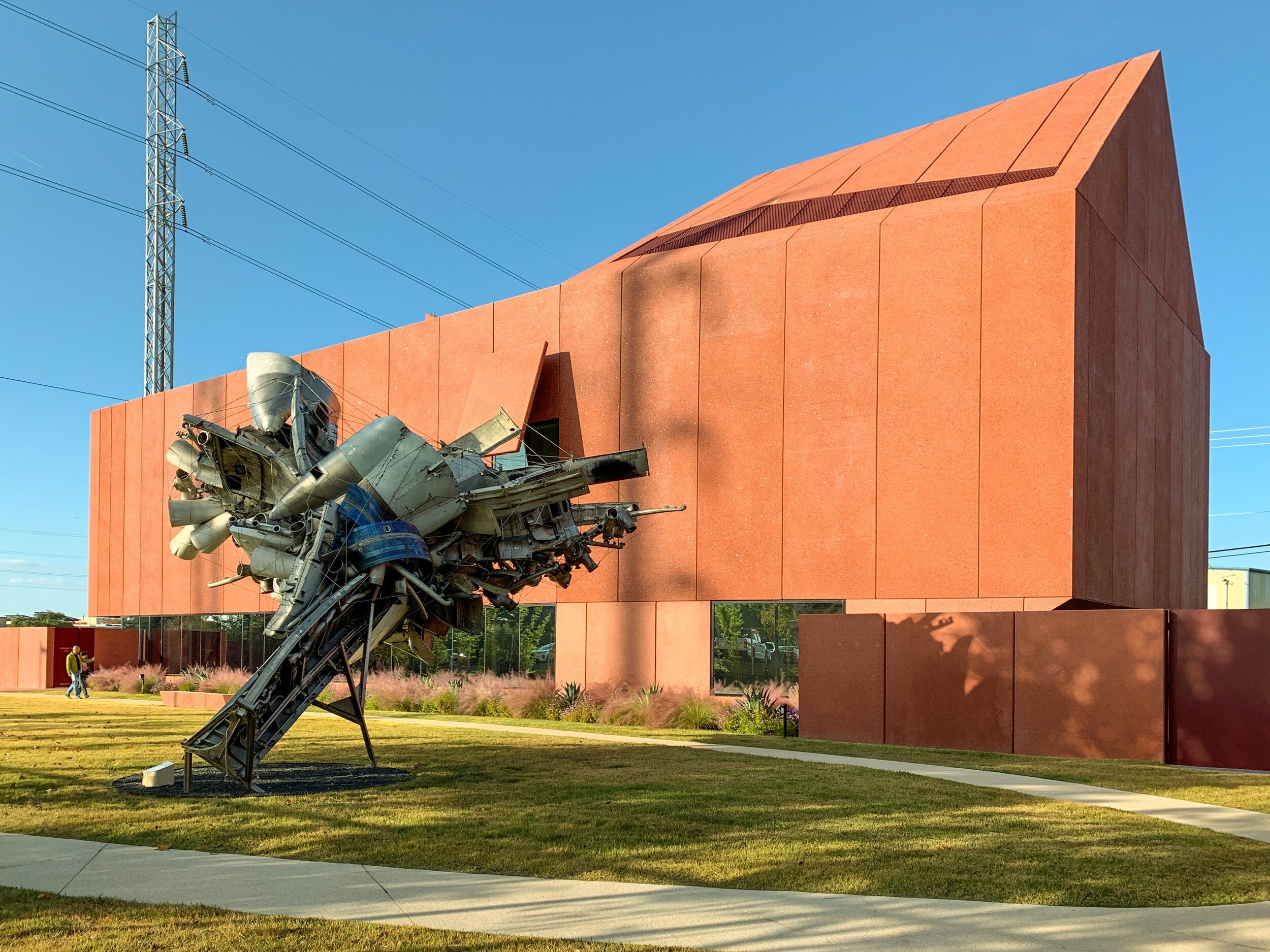
Pace’s vision was more a city, a collection of turrets and tonal reds, than a singular building. The museum’s design by David Adjaye and Adjaye Associates (with local Alamo Architects as the associate architect) interprets the fundamental physical characteristics and feel of the dream-sketch - multiple faceted forms with colorful, light driven highlights - into a building that is sculptural and form-driven, and is as evocative as the contemporary art housed inside. Pace, who passed in 2007, and her organization realized the critical importance of architecture’s role in both housing art and as an expression of art.
I visited on a bright, Texas November afternoon. One of the things that I wanted to do do during my maternity leave was to visit and revisit new and old cultural institutions in San Antonio, so my husband and I bundled up our 4-week old son to walk the grounds, take in the art, and experience one of the most heralded pieces of architecture completed in 2019.
There are multiple ways to approach and analyze Ruby City. It is located to the immediate south of downtown but inside of I-10 on a portion of the urban core that is not quite close enough to Southtown and it’s gentrification but also not quite a residential area or an industrial area or a canal area, although it is adjacent to each of those typologies; older homes, nearby apartments, a post office, warehouses, motels, and a yet-to-be-developed portion of San Pedro Creek, still encased in concrete and more drainage ditch than creek (as is typical of the majority of this downtown water feature, and what has spurred major redevelopment and reinvention of the creek), all exist nearby. Asphalt parking lots with postal delivery trucks, wire mesh fences, towering utility poles, and thick electrical lines visually define the immediate area. One pole even encroaches on the Ruby City campus, complete with posted signage; it is as if it is a contemporary art piece. The museum / gallery is a short block away from the Pace Foundation studios, lofts, and art garden. Architecture tours wander out of the museum. Parking is found along the street, with oddly tall curbs and limited sidewalks.
The building is challenging to take in and understand, hard to photograph. Its massing and angles are not necessarily the most flattering, the glazing almost too flat and too shallow in relationship to the exterior plane of the precast concrete panel facade. The reds are almost too rusty and almost not vibrant enough (perhaps an unfortunate characteristic of the concrete panel material) - a funny thing to observe as the building and site walls are supposed to be unapologetically, fully-saturated red. The form is taut and almost shrink wrapped around galleries and art storage spaces, asymmetrical and ungainly in its proportions. The detailing of the precast panels make the execution of the faceted edge conditions somehow both sharp and soft, with 1/2” unsealed joints at every joint, corner, and connection. The single, popped out panel that shades one of the gallery windows is a beautiful feature from both exterior and interior views. The solar control is curious - entries are cast entirely in shadow, galleries are over-exposed in too much light (as evidenced with drawn shades above the front entry) - this is typically a highly studied, highly executed, and highly designed element of museum and gallery spaces. Note: a massive, sawtooth clerestory is located above the main gallery space that seems to be operating correctly at providing natural lighting at museum-level qualities - indirect and controlled. The quality of light as it hits the faceted facade of the building and the resulting sharp lines of shadow are extraordinary. The landscape needs more time to mature and grow in. The adjacent garden is curiously flat and sparse, the hardscape and patio area unfortunately empty (I hope, with intention). The Nancy Rubin sculpture is fantastic, particularly when viewed upon the return with Ruby City as its backdrop. The Susan Phillipsz audio piece Sunset Song was a pleasant surprise, playing on an 8-minute loop from a lone speaker in the patio area.
We were taken by Cornelia Parker’s Heart of Darkness and Issac Julien’s PLAYTIME. The most striking piece was Alejandro Diaz’s Muebles (Hatstand), which sobered both my husband and I with the fine level of realism, humanity, pose, title, and social commentary.
iPhone photos are below.


